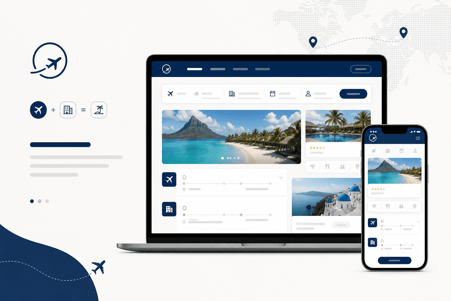
Background
CheapOair customers could book flights, hotels, and cars separately — but not as a cohesive vacation package. Package shoppers were stitching trips across sites, and we were leaving revenue and loyalty on the table.
Problem Statement
No native flow existed for combined flight + hotel booking. Users who wanted bundled savings and a single itinerary had to leave the product ecosystem.
Business Opportunity
A vacation product would attract deal-motivated travellers, increase average order value, and differentiate CheapOair in a crowded OTA market — especially for users explicitly searching for packages.
Proposed Solution
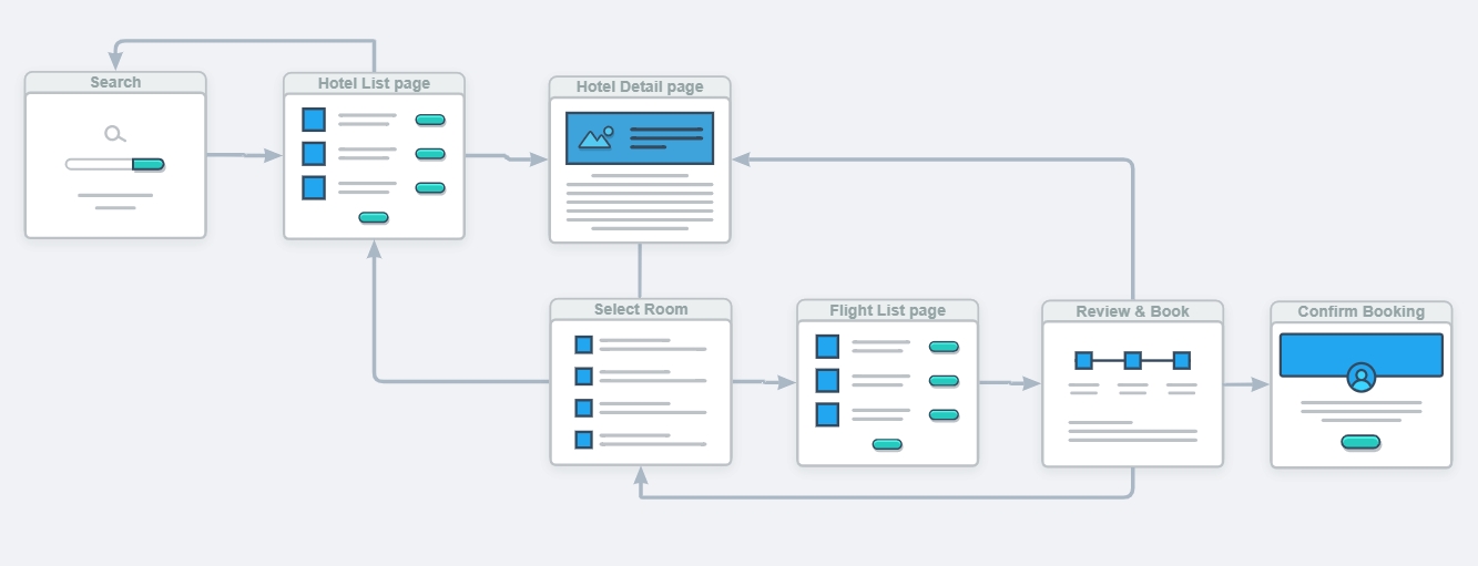
I designed an integrated vacation journey: combined search, transparent pricing, and a booking path that feels like one product — not two siloed flows glued together.
My role & UX approach
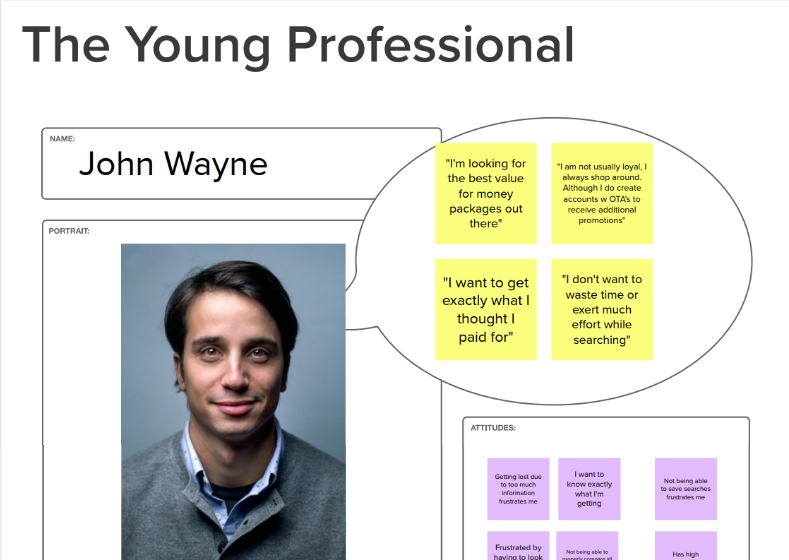
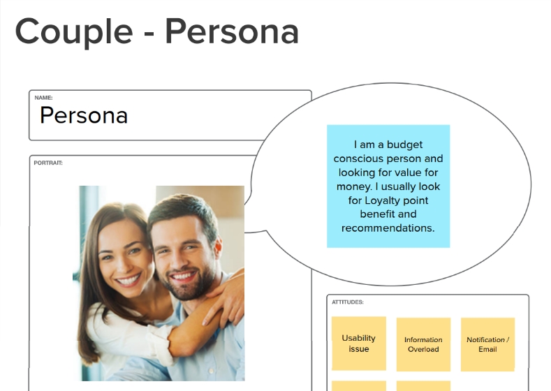
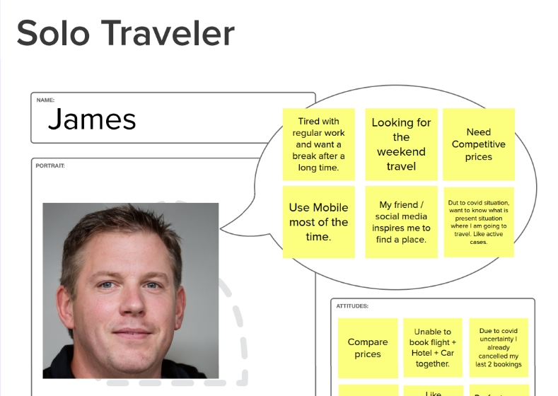
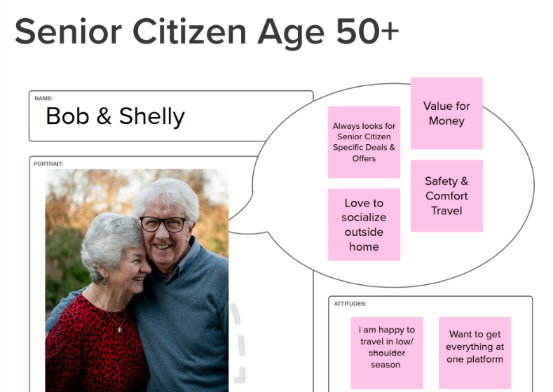
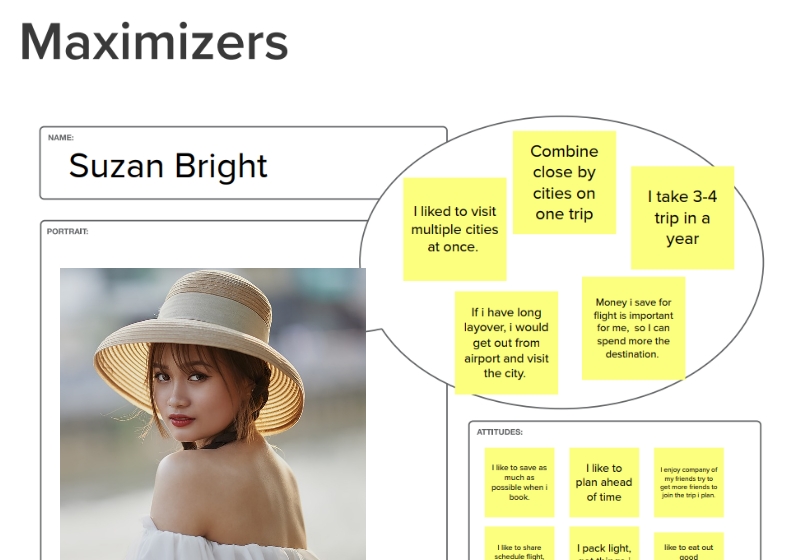
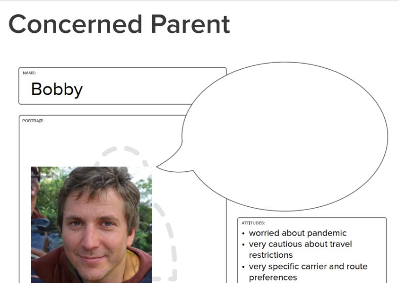
- Defined six distinct vacation personas to stress-test flows for families, couples, solo travellers, and budget vs. premium segments
- Mapped customer journeys from inspiration through search, selection, and checkout — highlighting drop-off risks
- Benchmarked competitor package UX for pricing display, date flexibility, and hotel swap patterns
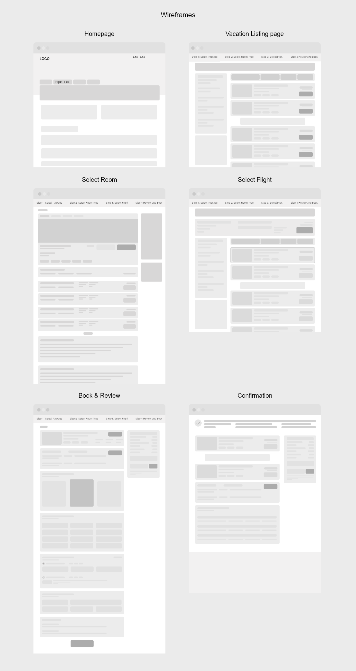
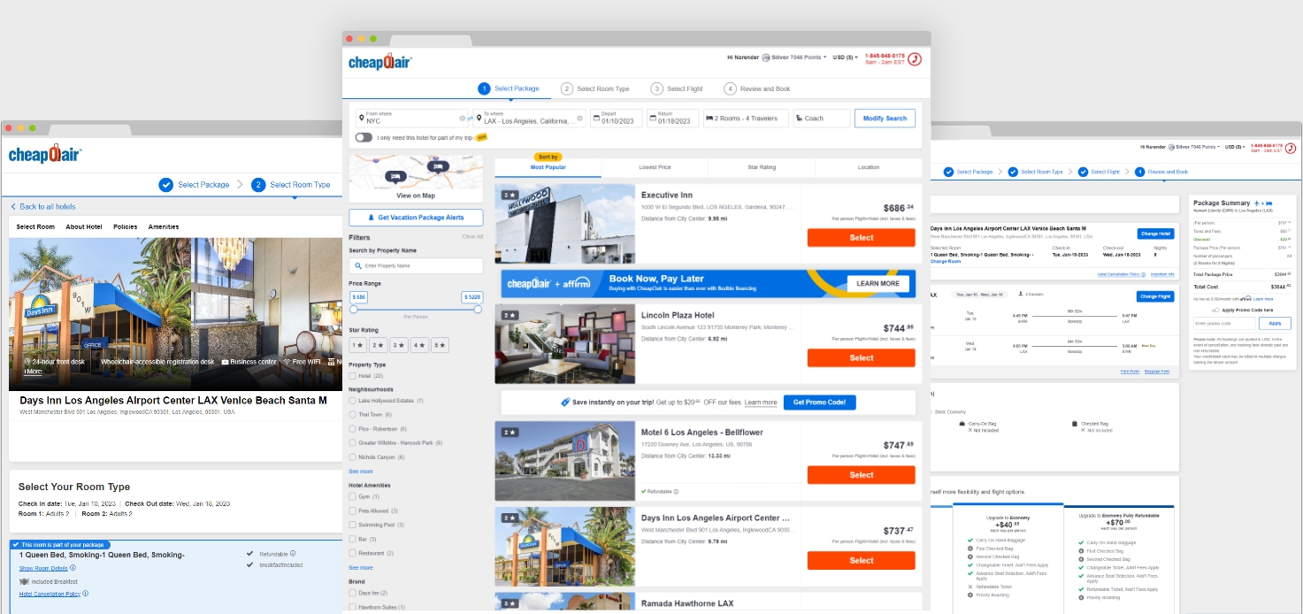
- Created wireframes and hi-fi UI focused on clarity: what's included, what costs extra, and how to modify components
User personas
User flow & wireframes
Final UI
Outcomes
- 23 vacation bookings in the first month, with steady growth afterward
- Positive user response to the bundled approach — fewer tab-switches mid-booking
- 52K new user subscriptions within three months of launch
- Improved customer satisfaction scores tied to clearer package transparency